I have a lot of experience using Excel for data processing and visualisation, but until today I had never used Microsoft’s business analytics tool, Power BI (Business Intelligence).
Power BI Desktop can be downloaded here: https://powerbi.microsoft.com/en-us/get-started/ and used (with some restrictions) free of charge.
To try it out, I started off by importing my 2020 running data after I saved it as a CSV file for simplicity.
There is a huge amount of crossover in the way that Excel, Word, and PowerPoint enable the user to interact with them, but Power BI is apparently very different from Office applications.
I did however manage to cobble together some simple charts. Dealing with dates and their formatting in Power BI certainly does not appear to be a strong point compared to the easy manipulation possible within Excel. There is also a lot less information available online about Power BI than there is about Excel which increases the gradient of the learning curve.

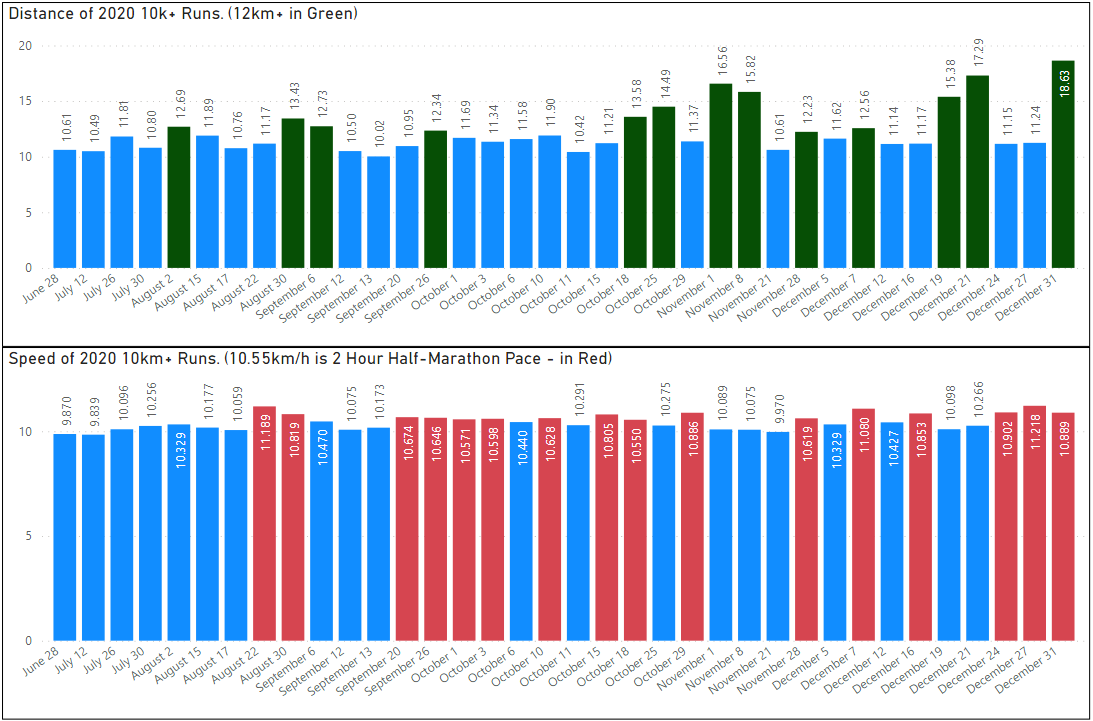
I also did a little filtering and conditional formatting after digging around a little. Below for example are all my 10km or longer runs of 2020 with highlighting of 12km+ and 10.55km/h+ runs.
Now I have to work out how to adjust the range of axes, the labels on axes, the tick points on axes, the location and font weight of data labels, etc etc.

It is starting to look a bit better now. The x-axis does not show every day of the year though, just the >10km run dates. Some data wrangling is probably required to achieve that, but it will have to wait for another day.