I have continued to experiment with Python to draw data charts, this time setting up Python (and Pandas, Numpy, SciPy, and Matplotlib) on Google Cloud Platform (https://cloud.google.com).

Today (6th April 2021) I downloaded the latest official UK Coronavirus reported case data from https://coronavirus.data.gov.uk/details/cases and tried out some Matplotlib formatting and labelling.
I made a column chart with labels and different colours, and also added 7- and 14-day rolling average lines to the chart. Click on the chart image below to view at full resolution.
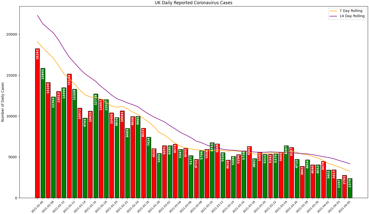
The chart shows how since the 25th March 2021, the rate of fall of daily case numbers picked up pace (shown by the steeper gradient of the 7-day compared to the 14-day rolling average).
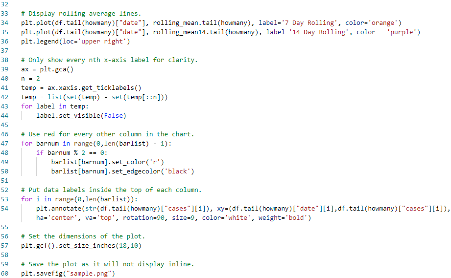
The only problem I could not resolve while using the Cloud Shell Editor and Terminal on the Google Cloud Platform was displaying the generated plot inline. Instead I had to save it as an image which could then be viewed (and would automatically update) in the Editor.