Here are the stats for my longest run of 2021 so far (and my sixth longest run ever): and here is the map of the route together with the elevation profile:
Data Analyst
Author: neil
2021 Running Record – Jan to Feb
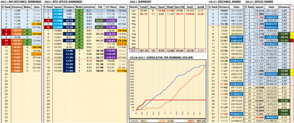
Here is my running record from 1st Jan – 28th Feb 2021. Click on the table image below to see the details clearly. * For details on the WMA age-grade scores, see here: http://www.neilmcniven.co.uk/comparing-the-quality-of-timed-runs-of-different-distances/. Below are my record 7 day and 14 day total running distances from 2019-2021 inclusive.
Men’s 100 metres Track Best Times
Looking at the fastest one-hundred 100 metre runs in history with raw data from WorldAthletics.org throws up some interesting statistics. There are a lot of athletes who have run a top 100 time who have served doping ban(s): Those who have served a doping ban are in italics in the table above. 68 out of…
Top 100 Men’s One Mile Track Running Records
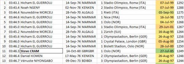
I was just looking at the best one-mile running race times in history, inspired by my own ‘best’ one-mile time of around 7 minutes 30 seconds. Below is a list of the fastest fifty one-miles ever run. British runners are highlighted, because patriotic. [Raw data from WorldAthletics.org] Looking deeper, only two of the fastest fifty…
Comparing the Quality of Timed Runs of Different Distances
I run a wide range of distances from 5k up to (soon) half marathon, and I wanted to find a way to compare the relative quality of those runs. For example, which is the better achievement, a 10k in 53 minutes or a 5.9k in 28 minutes. I found and read this article (https://rat.run/articles/content/age-grading) about…
2. Conditional Formatting of Bar Charts with Power BI and Excel
I have continued experimenting with Microsoft Power BI trying to find situations in which it is faster and easier to use than Excel for data visualisation. If I find something faster and easier in Power BI (in which I have <=0 experience), then it really must be a strong use case for the application. Looking…
Times Tables Question Answering Success
I collected data for one month on the timestables.me.uk website from the Online Times Tables Test to look at which questions were most commonly answered correctly or incorrectly. During the month chosen, there were 1.2 million times tables questions answered by schoolchildren from around the world of which 91.4% were answered correctly. Looking in more…
Travelling Salesman Problem with Excel VBA
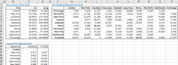
The travelling salesman problem (TSP) is defined as follows, “Given a list of cities and the distances between each pair of cities, what is the shortest possible route that visits each city exactly once and returns to the origin city?”. Increasing the number of cities increases the number of possible routes enormously which makes this…
Predicting Future Football League Table Positions
Pictured above is a chart which shows the estimated probabilities of the league position of each team after a round of matches – in this example Round 16 of the English Premier League at the end of 2020. * Liverpool, then top were leading Everton by 3 points with a 10 goal goal difference advantage…
Rate of the Drop in UK Covid-19 cases 21Feb21
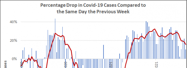
The chart above shows the percentage drop in detected Covid-19 cases comparing each day to the same day one week earlier, and covering the dates from 1st Nov 2020 to 21st Feb 2021. The trend shows that (even before the lifting of restrictions from lockdown #3), cases could start increasing again by mid-March 2021. [Raw…


