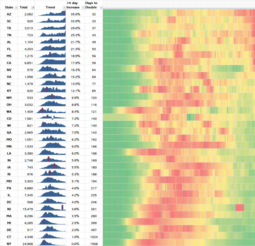
My chart below shows the growth of total Covid-19 deaths in all USA states which have recorded >500 deaths so far during the pandemic until today, 11th July 2020. It is sorted on the percentage by which the the total recorded deaths has increased over the last 14 days.
For each state the total deaths, trend, percentage increase of the total over the last 14 days, and the number of days it would take for the total deaths to double if things continue as they are unchecked.
The heatmap (covering March 1st to July 11th 2020) shows the 7-day rolling average of deaths reported per day in each state. It is formatted so that the heat colours for each state represent the relative level of infection within that state’s own outbreak only. This better shows the trajectory of Covid-19 peaks and troughs experienced by each state, particularly when comparing states of vastly different population sizes.
Click on the chart to make it full-size.

States in the South and South-West USA are experiencing the fastest growth, and many are heading up the curve of a second wave which will be much more deadly than their first wave of Covid-19 infection.
[Raw data sourced from covidtracker.com]