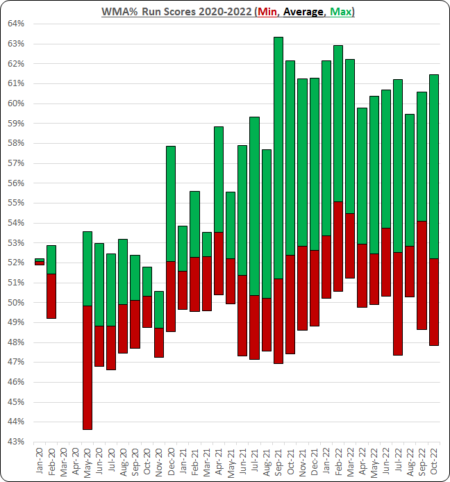
Here is a visualisation of my WMA (age-graded speed measure) for my runs between January 2020 and October 2022.
The top of the green bars shows the maximum WMA achieved each month, the bottom of the red bars the lowest WMA run each month, and the average WMA is shown by the point where the red and green bars meet.
Green bars that are long relative to the red bars should indicate a good training protocol of large volumes of slow aerobic runs with a few hard (and hopefully fast) runs each month.
