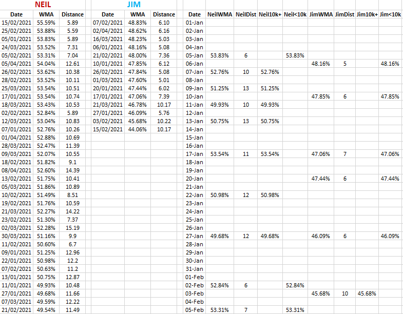
Today I used Excel to compare my current training for a half marathon in early September 2021 with the training of my friend who is training for the London Marathon in late April 2022. I looked only at runs of over 5km so far (8th April) in 2021 with my data coming from my own records, and my friend’s from Strava.
(WMA refers to a comparison method of the grading of runs of different distances for athletes of different ages, and it is covered here: http://www.neilmcniven.co.uk/comparing-the-quality-of-timed-runs-of-different-distances/.)

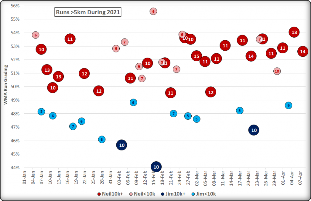
The chart below shows my runs of over 10km in red, and under 10km in pink. My friend’s over 10km runs are in dark blue, and his under 10km runs are in cyan. Each data point is labelled with the distance of the run rounded to the nearest kilometre, with the x-axis showing the date of the runs and the y-axis its WMA grade.
Click on the chart image to view in full size.
