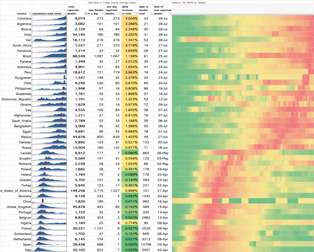
The chart below shows all of the countries in the world that have reported more than 1,000 Covid-19 deaths since the start of the pandemic.
Using a 7-day rolling average for each country the maximum deaths in a day, the date it occurred, and yesterday’s figure are given.
The daily percentage increase in the total death count is then given from which the number of days it will take (at that growth rate) for the total death count to double is calculated and presented.
The heatmap (covering March 7th – 28th July 2020) shows how the number of daily deaths have increased and decreased during the pandemic.
The blue trends column is incorrectly headed cumulative total trend. It should read daily trend because that is what it shows.
Click on the chart to view in full-size.

Countries near the top of the table are experiencing higher Covid-19 deaths per day than ever before. Countries at the bottom are a long way past their Covid peak…for now.
[Raw data sourced from https://www.europeandataportal.eu/]